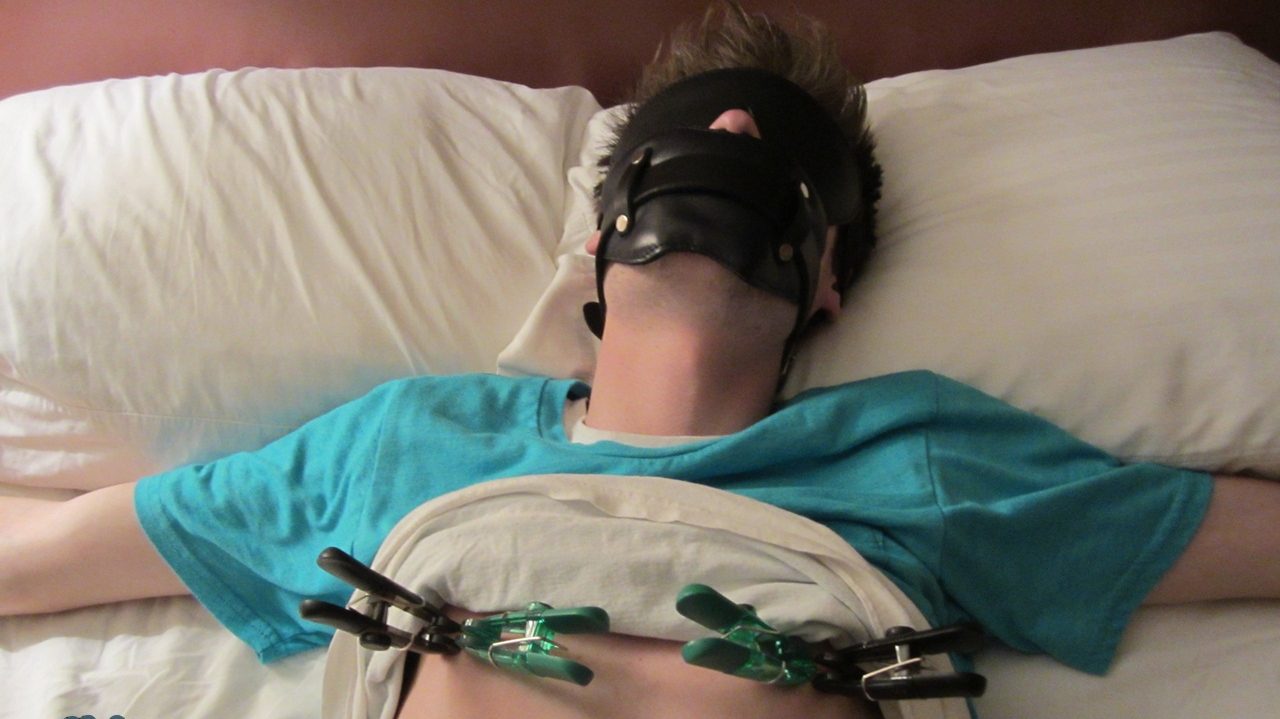
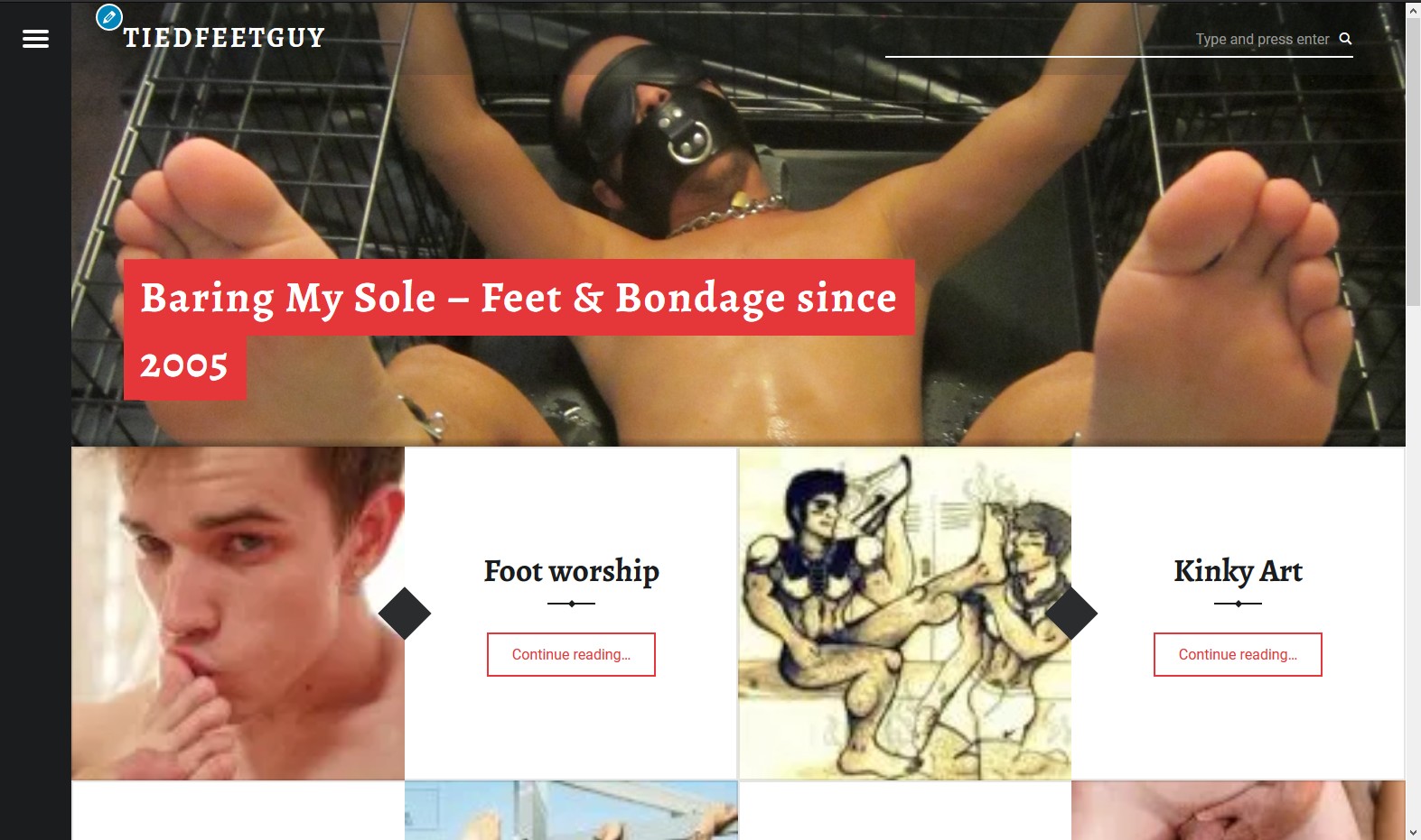
Every once in a while, I like to change things up, and I’m considering a new look for the blog. Sample pics below:
Basically, it would only post the header pic of each post, rather than the entire post. If you click on a single post, it would look like what you’d see below, with arrows at the left which would allow you to advance forward or back to the next post without a need to return to the home screen.

The advantages to me: very clean, streamlined look; still can see many posts at once in case you don’t visit daily; full screen format.
The biggest disadvantages: 1tou’d lose the ability to see all the posts at once, which I sort of liked (though I admit it did make things look cluttered); no more sidebar, it’d all go inside the menu; and because of the way this program works, all the thumbnails on the home page are a bit blurry… something that can only be fixed if I reformat nearly every header pic, which would be well over 400, so I doubt I’m going to do that, lol. The pics are all in focus in the actual post. There may be a way to fix it, but I’m hoping it wouldn’t cause more problems than it’d create.
So what do you think… do you like it, and could you live with slightly blurry thumbnails? Please vote at my twitter or below!


