I know it’s actually been up for a while, but I haven’t had a chance to discuss it yet! Just like to change it up once in a while, especially for a blog where I post daily.
I thought it would be nice to be able to see larger thumbnail pics for the posts on the main page, as well as see the date of the post (a feature that wasn’t available on the last template I used). This also allows for me to have a larger range of header pics, as they can be larger. Before, they were limited to a very narrow width.
It also seems to allow for easier navigation, as all the links and categories are listed right on the home page, so if you see a bondage post you like, you can just click the “bondage” tag and see all my bondage pics immediately!
The one small issue I have with this template is while I love to see the header pics on the main page, I wish they didn’t have to show up on the posts pages. As far as I can tell, there’s no way to disable that. But it’s a pretty minor complaint.
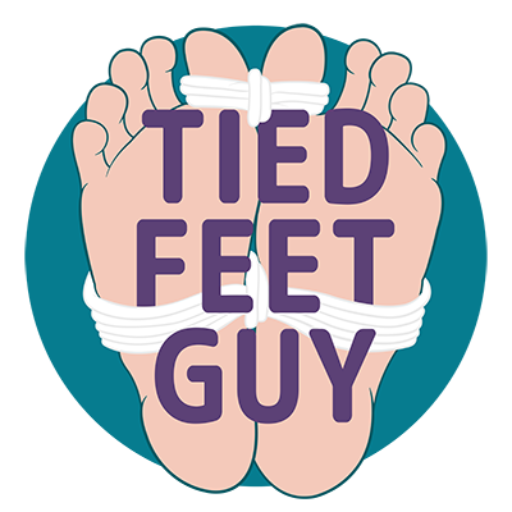
Additionally, I felt it was time to update my logo. My kinky friend Restwalker (who was also a cyber slave for a while) designed my original logo (on the left), which I loved. But I had also had it for over 10 years, so a bit of an update was welcome.
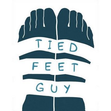

My other kinky friend, boy_got_sole (his twitter is private) created a new one for me, which I will now be using on all future posts… though admittedly, I still have a lot of backlogged posts that I haven’t gotten around to uploading yet, so you’ll still see the old one pop up now and again.
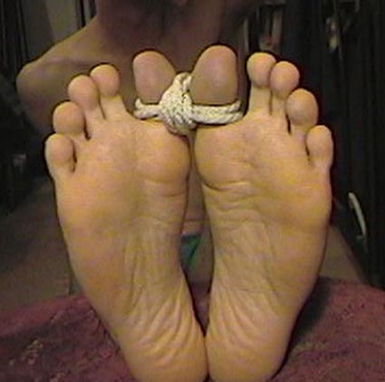
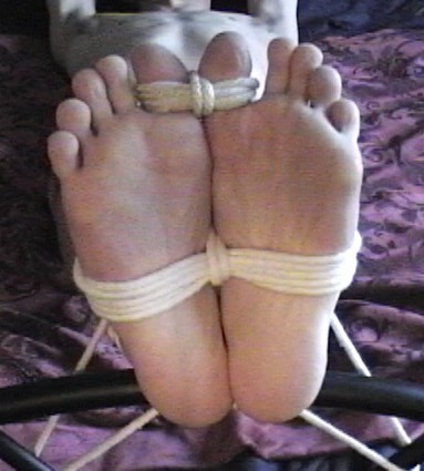
Fun trivia fact… both logos are based on my own feet–which I requested. Thought if the logo is representing me, it should be me in the pic! See the resemblance?
And by the way, both are graphic designers, so if you want some graphic design, feel free to reach out to either one.
Hope you enjoy the new looks!
