Guess it’s just the season. First Metalbond, now me. Although I haven’t mentioned it much here, I really have been thinking about this for a very long time, and have been working on it behind the scenes on and off for months. There’s nothing really new here in terms of content; it’s just a different look and arrangement. Although do note you can now share posts to Twitter, Facebook, email, etc. at the bottom of each post. There may be a few details that will still need some tweeking, so if you catch anything off or missing, let me know.
I have to give Restwalker a lot of credit for his assistance. He’s the one who knows exactly how long I’ve been thinking about this, and I am very indebted to his work and assistance. He also created my new logo.
I gave him quite a bit of artistic license, so he surprised me when he told me the logo was based off the outline of my own feet, as seen in this very old pic here. So even better!
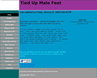
So I admit most of you may find the color scheme a bit unusual. But it harkens back to the color schemes of my initial websites when it was really starting to take off. It was teal, purple/pink, and blue. So those colors are in tribute. I tried to use them in a more modern way.
 |
| A snapshot of the old site, from 2004-5. Another version of the site was black and purple, but for some reason, I’ve always enjoyed this scheme. |
I know it’s quite a change. But as much as I enjoyed the old design, I’ve had it for a very long time. And it was looking cluttered. I’m hoping this will be more streamlined, and easier to find things. I hope you enjoy!


